Project Summary
Product
A mobile application for a Japanese Restaurant, where users can view food items and order delivery
My Role
UX & UI Designer
Timeline
May 2023 – July 2023
Tools
Figma
Understanding the User
I conducted 6 interviews to understand the daily usage of menus and ordering apps.
The interviews revealed the importance of simplistic view and clear categorization of options. An important pain point was not being able to understand the meal without a picture.
Persona

User Story
Melinda is a vegan with international friends who needs easy selection of different dietary restrictions when ordering food because she wants all her friends to be included and have delicious food.
User Journey Map

What did I learn about the user?
Informativeness
Decisions cannot be made without key information being present about ingredients & allergens.
Simplicity
Crowded information or lack of simple categorization reduces the joy of ordering food.
Visuals
Textual information without any visual support is not enough to make a secure decision.
Starting the Design
Information Architecture
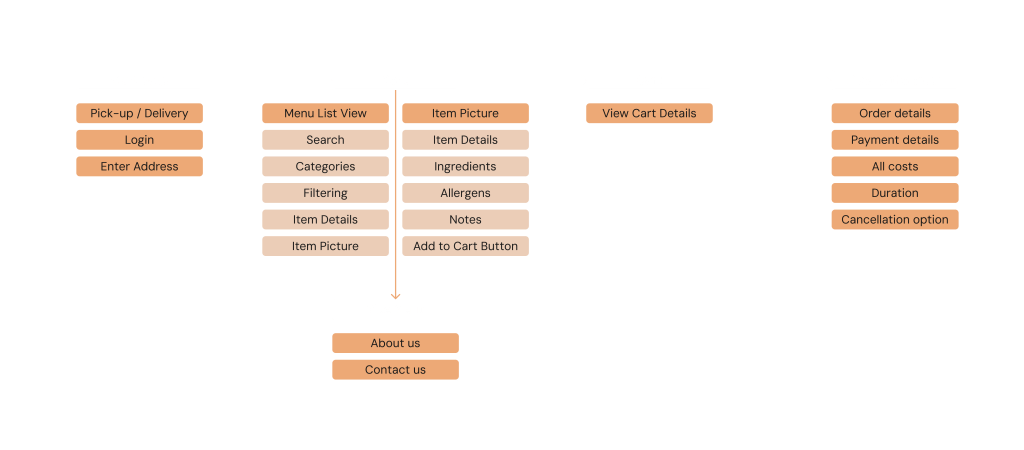
Creating an Information Architecture allows me to understand which pages lie within each other and how many pages there are to design.
Digital Wireframes
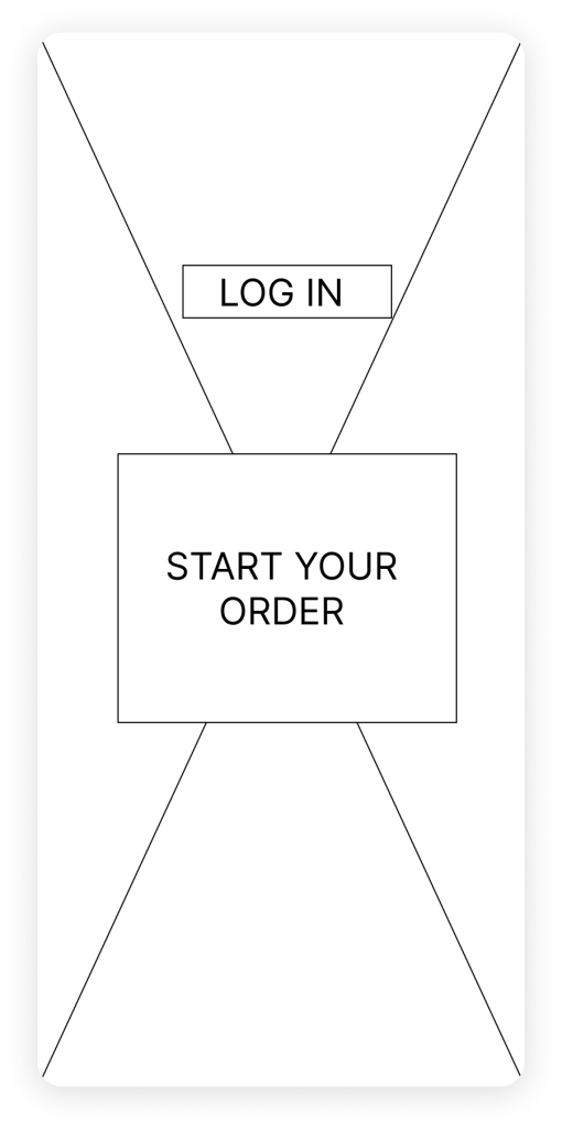
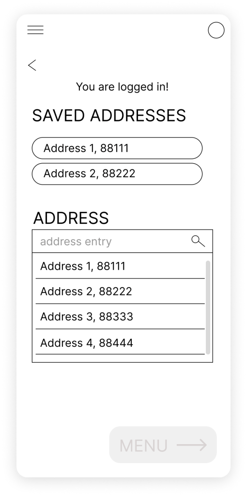
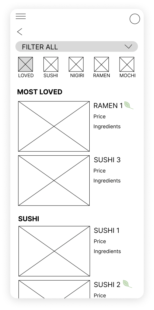
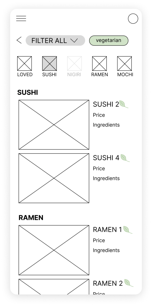
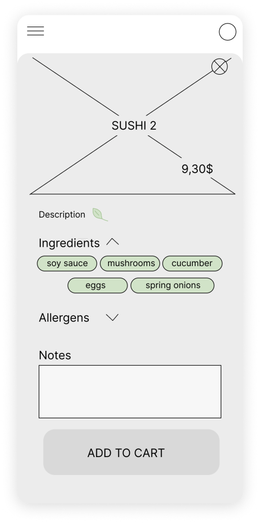
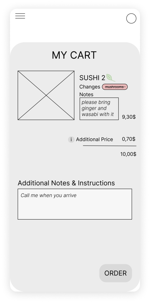
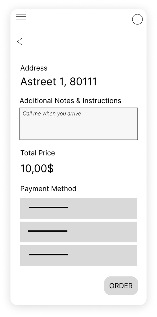
Next, transfering the most prominent ideas into Figma as a Low-Fidelity Prototype helps us test the functinality of the design with potential users.



Usability Study
I conducted 2 rounds of interviews with 5 participants each.
Accessibility of Menu
It was observed that 3 out of 5 participants were frustrated that they had to put in the address first and then did not see it the menu.
This means that the menu was not accessible fast enough and is not visible throughout.
Therefore, an insight is: the menu should be reachable in only 1 step, the address entered at a second step, and the address should be visible throughout the menu page.
Menu Navigation
It was observed that 3 out of 5 participants were confused about the subcategory navigation of the menu.
This means that the users are not able to understand multiple types of navigation options and would rather have a simple and direct design.
Therefore, an insight is: only 1 navigation option should be present to guide the user more easily.
Missing Action after Order Completion
It was observed that 2 out of 5 participants did not know what to do in the last confirmation page.
This means that the step to directing the user to the homepage and a general homepage itself is missing.
Therefore, an insight is: there must be a homepage, where the user can go back to easily, track their order, and view the menu as they wish.
Unfriendly or invisible notification
It was observed that 4 out of 5 participants did not see or like the notification about the minimum order requirement.
This means that the notification is not visible or friendly enough.
Therefore, an insight is: the notification has to be clear, easily visible, and friendly.
Mockups
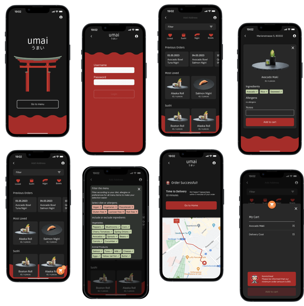
Takeaways
- Importance of User Testing: Understanding the user through usability studies are very important in revealing the true use of the product. The way I think is different than the way others do. Something intuitive to me might be not so intuitive for others. Usability studies are the core of human-centered design.
- Process of building a new design: Design systems are vital to develop to build a coherent UI. However, when starting a new product from scratch, it can be difficult to define the design system to its full extent. Therefore, iinitially, one must explore potential designs. Once the first idea for the design is settled, create the design system to be used created.
