Project Summary
Product
A web application for Small-to-Medium size businesses
My Role
Design Lead and UX & UI Designer
Project Duration
May 2025 – today
Tools
Figma
Overview
cleverwatt is a startup, that reduces energy costs of small-to-medium sized, family-owned manufacturing businesses by providing an energy consumption report using advanced analytics.
Their goal is to improve the usability of the report and integrate AI into their reporting system. We, as the TUdesign Club, took this project.
I am working as the Design Lead together with 3 other designers, both planning the UX Design process and conducting it.
Design Process
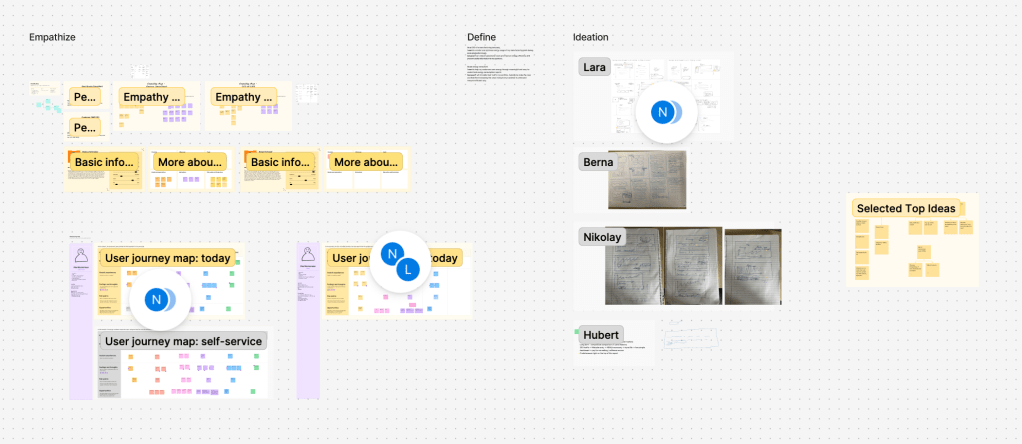
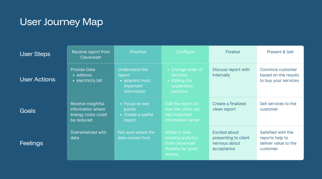
Together with my team, we started by joining in on customer calls to hear from them directly. After understanding their pain points, we created personas and a user journey map. This helped define the problem we were trying to solve. You can see the FigJam board we are using for our UX Process.
Next, we created wireframes and validated it with the cleverwatt team. After creating a style guide & design system for the UI, we created our first mockups. Recently, we conducted usability study with a user. In a next step, we will implement the feedback.
Understanding the User
Personas
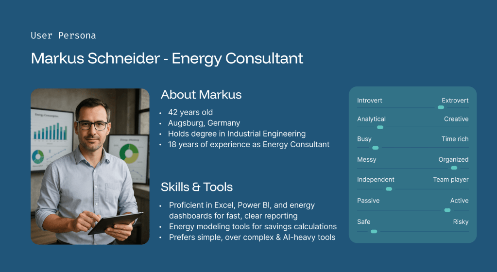
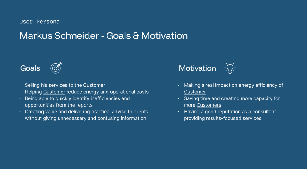
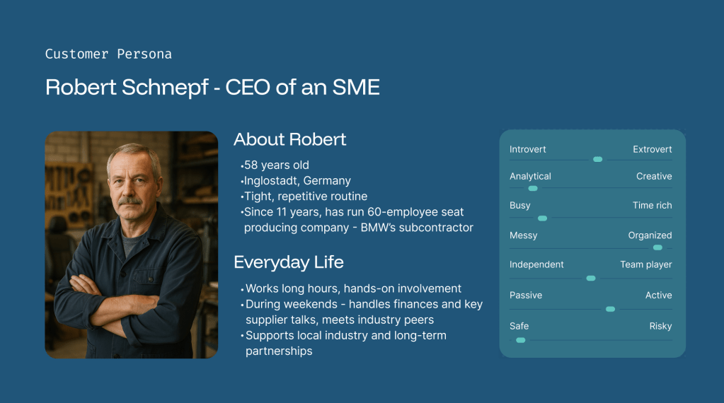
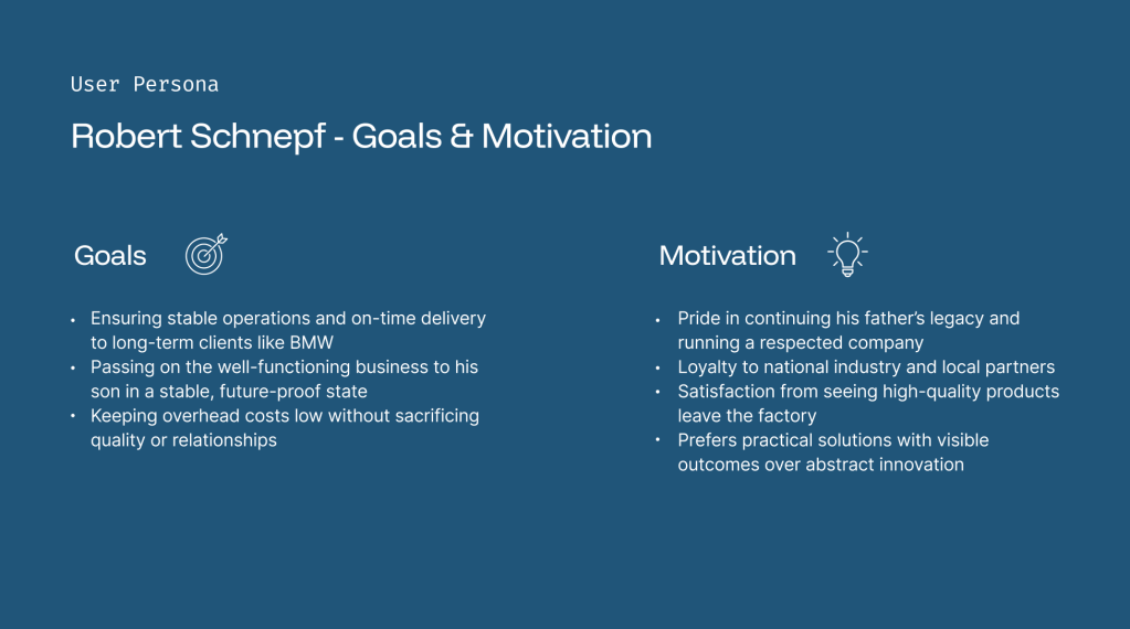
We identify the User Persona Markus Schmidt as the primary user.
User Journey Map
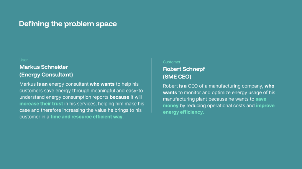
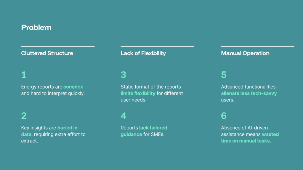
Defining the Problem
Problem Statement
Ideation
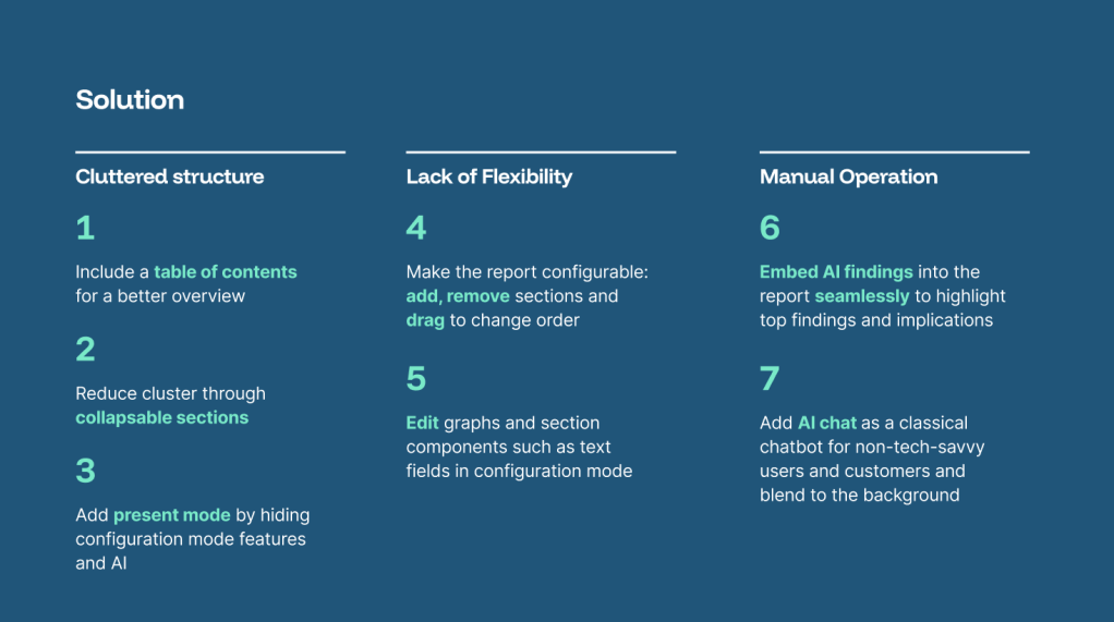
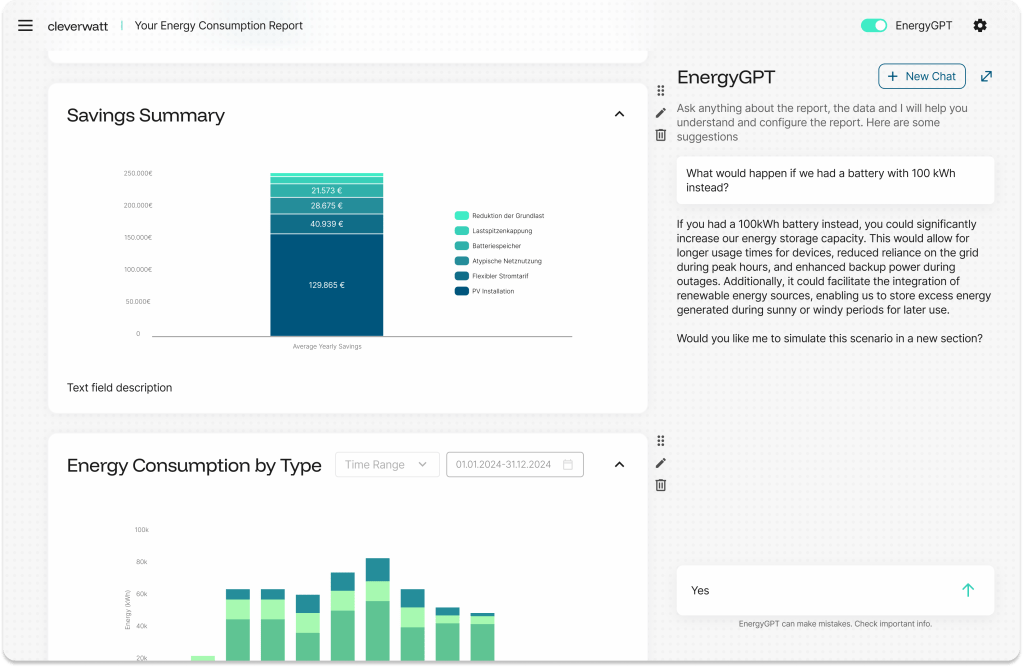
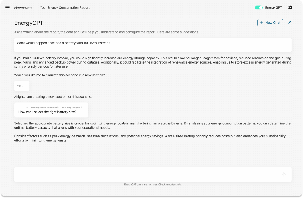
How might we use AI to support the user in prioritizing the findings of the report and configuring it?
Style Guide & Design System
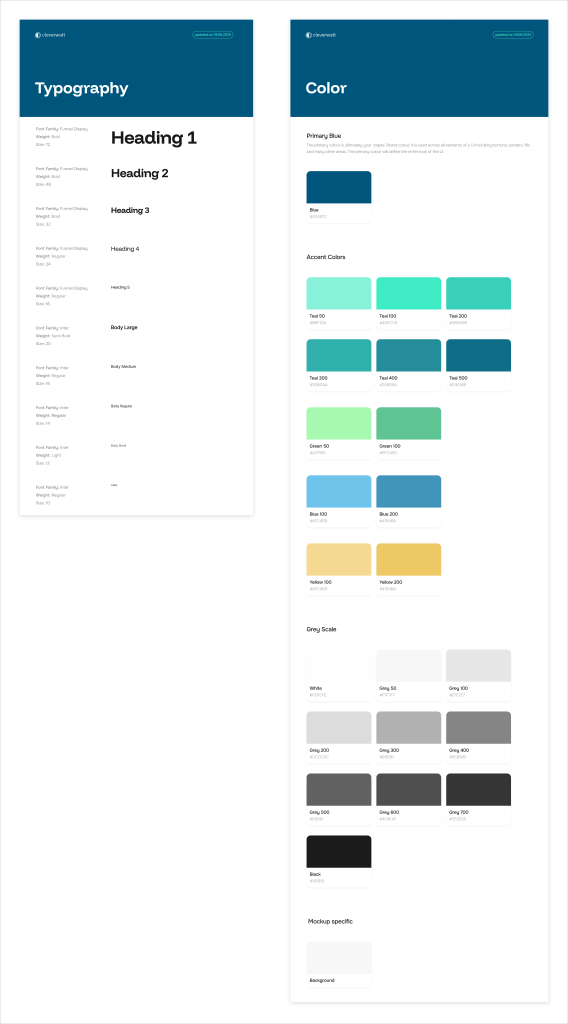
cleverwatt already had some design elements settled: some colors and typography. We increased the standardization and created a style guide & a primitive design system.
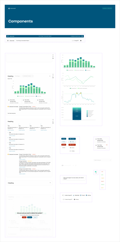
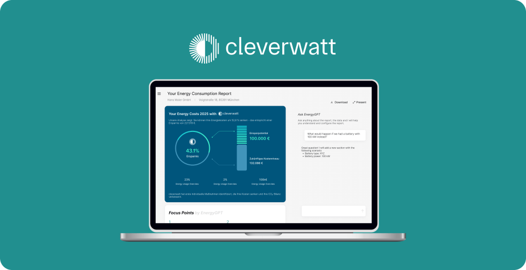
Mockups


Work in Progress
On 23.06.2025, we conducted a usability study, where we learned the following “To change”:
- Add different sections of a company as a dropdown in the top of the report, e.g. “Building A” “Building B” can be separate reports of 1 company.
- All data points should be visible, even if there is little space in a static way.
- Colors are a bit too close to each other for some graphs -> either differentiate the colors more or put the legend closer to the graphs.
- Some labels are too small -> increase the size of smallest label to 10.
- Add a “hide” or “skip” section option next to the collapsing [Quotes: “I would like to completely not show some sections to the customer”, “Das ewige hoch und runter scrollen – das war eine Katastrophe. Zum Schluss war Allem schlecht.”]
- Keep the Archive and make sure the archive exists actually (maybe in the bottom?)
- Delete the editing option for the section. Keep it for the text box only (Point 4 from Nikolay)
- EnergyGPT deactivation: need to think about what the point is: if data security then all sections with EnergyGPT need to disappear. Not just chat.
- Add the logo of the client into the report page.
- Create a PDF export option with selected sections and without huge empty parts because right now they are using the print option from their computer.
Good feebdack from user testing “To keep”:
- Table of contents in the right place and useful.
- Drag-and-Drop option great.
- Adding a new section with EnergyGPT is great.
- Archive is useful.
- Quoting is useful to ask questions when Jakob is not available.
- Report customization for logo & color was easy to find.
We are now working on the next iteration.
